Fall in 2021
2021-11-05
2021 Fall, UCI CMB program rotation
Author: Runhang Shu, PhD student
Affiliation: University of California, Irvine
Contact: darsonshu@gmail.com
Date started: 2021-11-05
Date end (last modified): 2021-12-13

This work is licensed under a Creative Commons Attribution 4.0 International License.
Introduction:
Notebook for rotation in Dr. Katrine White and Dr. Charles Glabe lab. It’ll log notes, ideas and inspirations from papers I read; Save a copy of bioinformatic and statistical analysis I did for reproducible science!
Table of contents
- Page 1: 2021-11-05 Literature review 1 - The concurrence of DNA methylation and demethylation is associated with transcription regulation
- Page 2: 2021-11-17 The Brucella data (1) - use non-duplicate unique 12-mer peptide sequences to search pattersn
- Page 3: 2021-11-20 The Brucella data (2) - use duplicated 12-mer peptide sequences to search pattersn
- Page 4: 2021-11-20 The Brucella data (2) - analyze in R
- Page 5: 2021-12-13 Generate rarefraction curve for the random phage peptide data
Page 1:
Background
In mammals DMNT (DNA methyltransferases) methylaze while TET (Ten-Eleven translocation deoxygenases) demethylaze DNA. Despite these two processes are apparently antagonizing, a few studies shed the light on the jointed effects of these two players on tumorigenesis.
Obstacles (what need to be improved?)
The DNA methylation level are usually assessed by “averaging” level or calculating the methylation heterogeneity/variation. Neither of these two approaches can delineate the degree of concurrence between active methylation and demethylation (unmethylated CpGs in partially methylated reads). Additionally, although a recent mathematical model takes methylation and demethylation into account for individual CpGs in stem cells, this model is not good enough in that it does not consider the spatial coupling of concurrence methylation at adjacent CpGs, which is critical for transcription factor and cancer gene regulation.
Objective
To test to what extend that the two players affect cancer gene regulations.
Methods
Bisulfite sequencing of embryonic stem cells of mice
Key findings
- Methylation concurrence represents a better metrics than traditional average methylation level and methylation variation to predict gene expression.
- Using DMNT- and TET-knowout mice, the authors indicate that there might be hidden patterns unseen by simply using “average” methylation level.
- Methylation concurrence is negatively correlated with gene expression.
- Uisng public available data: WGBS and RNA-seq data from Epigenetic Roadmao Consortium
- DNMT3A and TET1 prevent binding of each other mainly in TSS-proximal regions
- Methylation concurrence is associated with the repression of tumor suppressor genes
- TSGs (Tumor Suppressor Genes) are negatively associated with methylation concurrence
- Cell lineage genes are positively asscoaited with methylation concurrence
- Housekeeping genes have no association with methylation concurrence
- Methylation concurrence can see the unseen patterns in Undermethylated regions (UMRs) in relation to average methylation and methylation variation.
Page2:
Processed all fasta files (txt format) in HPC3 using a bash script
#!/bin/bash

#SBATCH --job-name=Bru      ## Name of the job.
#SBATCH -A CGLABE_LAB ## account to charge
#SBATCH -p free ## partition/queue name  highmem,hugemem,maxmem
#SBATCH --nodes=1            ## (-N) number of nodes to use
#SBATCH --ntasks=1           ## (-n) number of tasks to launch
#SBATCH --cpus-per-task=4    ## number of cores the job needs
#SBATCH --error=slurm-%J.err ## error log file

../pratt_package_500000/pratt fasta ./USA_naive/Bru14.txt -C% 0.5 -PL 11 -PX 1 -E 0 -FN 0 -FL 1 -ON 500
../pratt_package_500000/pratt fasta ./USA_naive/Bru15.txt -C% 0.5 -PL 11 -PX 1 -E 0 -FN 0 -FL 1 -ON 500
../pratt_package_500000/pratt fasta ./USA_naive/Bru16.txt -C% 0.5 -PL 11 -PX 1 -E 0 -FN 0 -FL 1 -ON 500
../pratt_package_500000/pratt fasta ./USA_naive/Bru17.txt -C% 0.5 -PL 11 -PX 1 -E 0 -FN 0 -FL 1 -ON 500
../pratt_package_500000/pratt fasta ./USA_naive/Bru18.txt -C% 0.5 -PL 11 -PX 1 -E 0 -FN 0 -FL 1 -ON 500
.
.
.
../pratt_package_500000/pratt fasta ./USA_naive/Bru50.txt -C% 0.5 -PL 11 -PX 1 -E 0 -FN 0 -FL 1 -ON 500
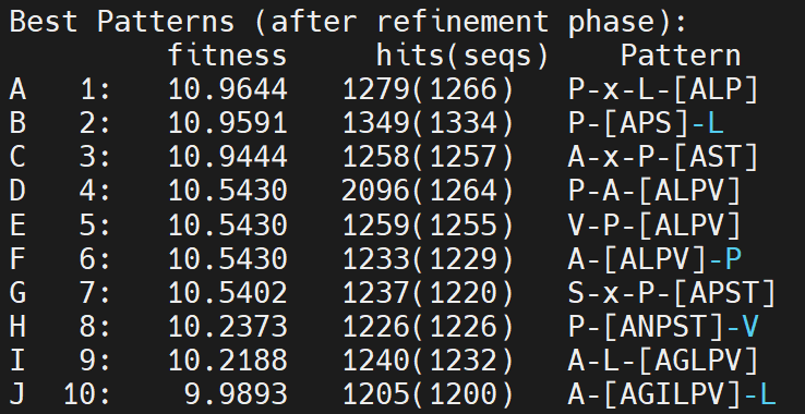
- Tried different C% (the minimum number of frequency of each pattern)
- C%=0.5 and 500 patterns
- C%=2 and 50 patterns
- C%=0.5 is clearly better than C%=2, becasue the fitness score is higher in the C%=0.5 output. Moreover, C%=2 gave too many patterns of only 2 amino acids
- Idealy, we want to get some patterns having the lengths range between 4 to 5.
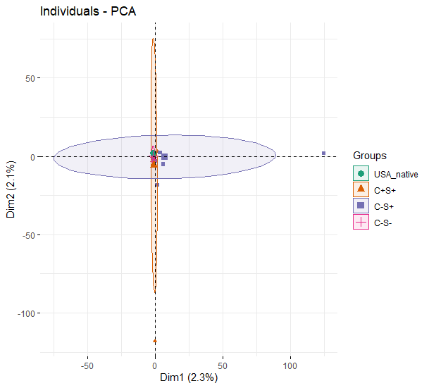
Principal component analysis
- Using the output from C%=0.5, I selected the top 500 patterns for each samples (81 samples in total), the occurance of each pattern was divided by the total number of sequences. For exaple, pattern P-L-S is found in 100 different 12-nt peptides in sample 1, which has 10,000 sequences. Then, 100/10,000=0.01 is computed and the resulting matrix (81 samples x ~2000 patterns) is used to run PCA. The figure below indicates the four groups are rather similar.
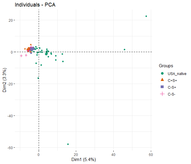
- Neverthelss, it is important to note that I did not take the number of each sequence into account. Using P-L-S as an example again, there are 100 unique sequences that have this pattern. 100/10,000 does not precisely reflect the real percentage of that pattern because each unique sequence may be sequenced multiple times during the Illumina sequencing. For example, in the C+S+ sample (B9_Bru__peptide_2_5257 ), PLPP pattern from the 12-nt peptide grPLPPnphfr has been sequenced 5257 times! But this pattern is not even ranked as at the top nor does it have a higher fitness score. Also need to note that having doubled sequences for one pattern does not mean the concentration of the antibody for that epitope pattern is also doubled.
Random Forest analysis
- Again, using the matrix of C%=0.5 with 500 patterns. 9 samples of C-S-, 14 samples of C-S+, 16 samples of C+S+, 42 samples of USA native.
- Out of bag rate is quite high (30%) when I am trying to classify four of the each group.
- Out of bag rate is low (~3%) when I made the response virable as binary (YES vs. NO) by grouping USA native with C-S- as negative, and grouping C+S+ and C-S+ as positive.
Page3:
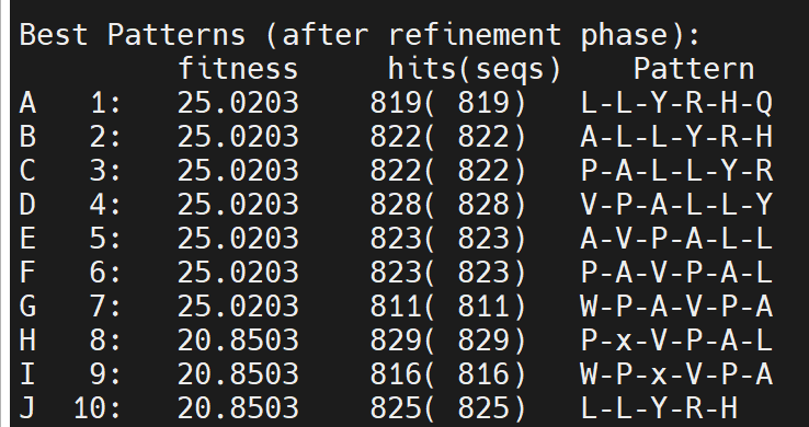
Search pattern with duplicated sequences
../pratt_package_500000/pratt fasta ./USA\ Naive/1_S98_complete_for_RF.txt -C% 2 -PL 11 -PX 1 -E 0 -FN 0 -FL 1 -ON 50
Below is the output
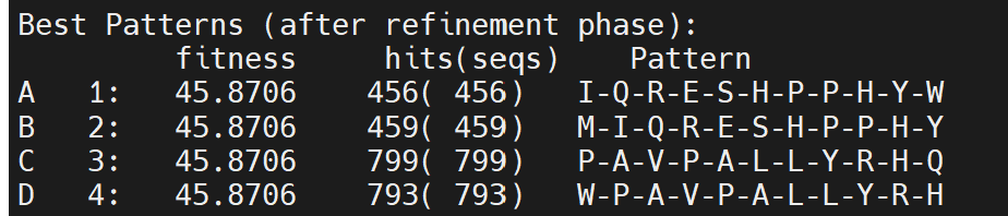
It looks like 2% is too low, so that each pattern makes up by identical duplicated sequences. Just because this sequences have the most abundant reads does not mean the antibody is at high conc. for this epitope. Another antibody could bind to many low-abundance sequences so that the sum of all the sequences is even greater the top1 sequence: IQRESHPPHYW. So, my next instinct is to increase the C% and see if the top pattern consists of many unique sequences instead of one. Ideally, we want the length of pattern range between 4-5 or 6-mer.
Now, increase C% to 10
../pratt_package_500000/pratt fasta ./USA\ Naive/1_S98_complete_for_RF.txt -C% 10 -PL 11 -PX 1 -E 0 -FN 0 -FL 1 -ON 50
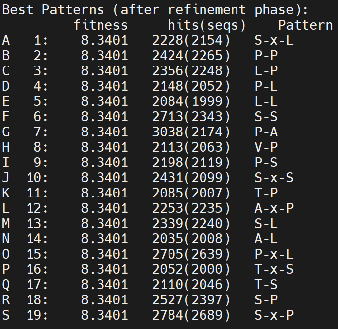
Oppus, did not look good at all… 2-mer can be found in any random sequences. One thing I learned from the result, at least, is that amino acids SPLAT are more abundant than the others. Why? 1) Random phage library is baised 2) sequencing baise? very interesting!
Now, decrease C% to 6
Still did not have any signal. Decrease to 4%, the top pattern is like this P-A-V-P-A-L-L-Y-R-H-Q. Then increase to 5%, it suddenly becomes like this: A-L-[LP]. Therefore, we should adjust the PL (Pattern Length).
Reduce PL to 6, looks better
However, the top3 patterns are exactly from the identify 12-mer peptides…
The question is which pattern is the real pattern: the pattern with 100 unique peptides vs. a pttern with 95 duplicates of one peptide and 5 unique peptides?
After multiple tries, I decide to use the following parameters
-C% 0.3 -PL 4 -PX 1 -E 0 -FN 0 -FL 1 -ON 200
Or should I just focus on the top50 from [Brucella (1)!], calculate the frequency of each pattern?
Page4:
PCA analysis
Based on the 200 patterns from each samples, the PCA plot indicates that USA and C-S- groups have very small variations while C-S+ and C+S+ have larger variations.
Random forest analysis
I build a RF model with 500 trees and 100 permutation using R package rfPermute (v2.5).
       Negative Positve pct.correct LCI_0.95 UCI_0.95
Negative       45       6       88.24   76.132     95.6
Positve        31       2        6.06    0.743     20.2
Overall        NA      NA       55.95   44.695     66.8
The out of bag rate is very high for positive group.
dim(data)
84 8389
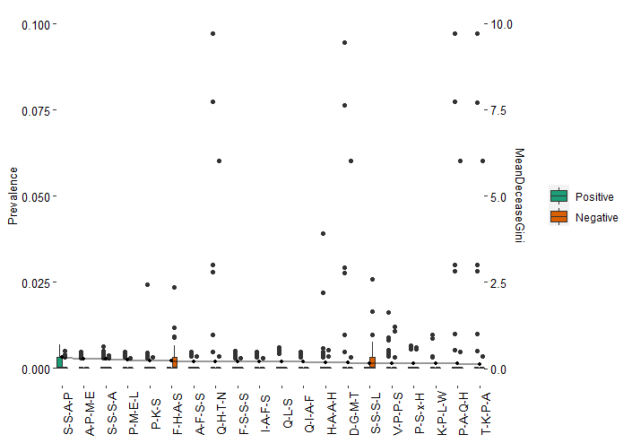
This is probably because that there are 8389 patterns across 84 samples. With that said, most of patterns are unique in each sample. These patterns are normally long such as ‘A-S-[ASTV]-L’. This kind of pattern will not be matched with the pattern of ‘A-S-[AST]-L’ or ‘A-S-[AT]-L’. Even in our barplot below which contains the top “important” 20 patterns according to RF model, the majority of patterns do not exist in most of samples.
To shorten the dataset and make the samples more comparable, I will only keep the top 1000 abundant patterns
         Negative Positive pct.correct LCI_0.95 UCI_0.95
Negative       45        6        88.2     76.1     95.6
Positive        9       24        72.7     54.5     86.7
Overall        NA       NA        82.1     72.3     89.6
Now, the RF model looks better.
        Peru USA pct.correct LCI_0.95 UCI_0.95
Peru      41   1        97.6     87.4     99.9
USA        2  40        95.2     83.8     99.4
Overall   NA  NA        96.4     89.9     99.3
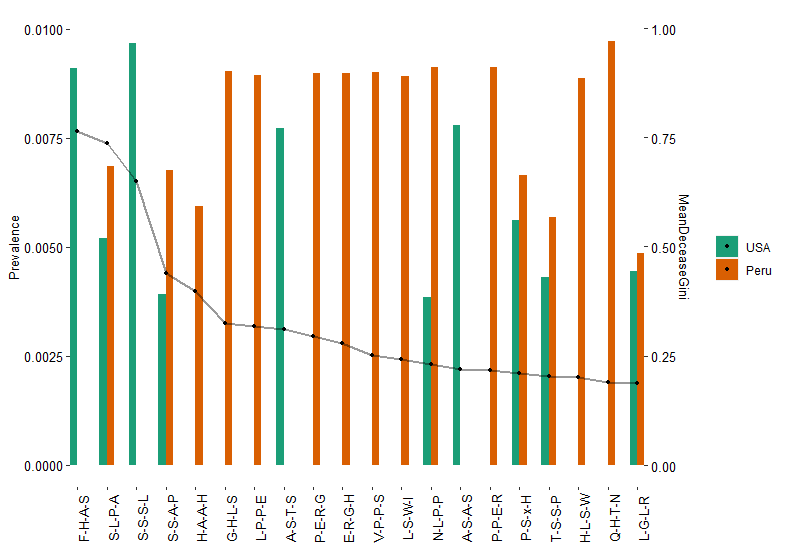
Also >95% accurately predict Peru from USA samples. Below is the 20 patterns based on the RF models. 1o out of 20 patterns only found in Peru but not USA samples.
[1] "F-H-A-S" "S-L-P-A" "S-S-S-L" "S-S-A-P" *"H-A-A-H" *"G-H-L-S" *"L-P-P-E" "A-S-T-S" *"P-E-R-G" *"E-R-G-H"
[11] *"V-P-P-S" *"L-S-W-I" "N-L-P-P" "A-S-A-S" *"P-P-E-R" "P-S-x-H" "T-S-S-P" *"H-L-S-W" *"Q-H-T-N" "L-G-L-R"
Plot it with prevalance and Giniscore
To shorten the dataset and make the samples more comparable, I will delete patterns that having bracket (e.g., A-T-[S-T-A])
There are 5488 patterns lefe after filtering.
           USA_native C+S+ C-S+ C-S- pct.correct LCI_0.95 UCI_0.95
USA_native         42    0    0    0      100.00   91.592    100.0
C+S+               13    1    2    0        6.25    0.158     30.2
C-S+                9    1    7    0       41.18   18.444     67.1
C-S-                7    1    1    0        0.00    0.000     33.6
Overall            NA   NA   NA   NA       59.52   48.253     70.1
         Negative Positive pct.correct LCI_0.95 UCI_0.95
Negative       46        5        90.2     78.6     96.7
Positive       23       10        30.3     15.6     48.7
Overall        NA       NA        66.7     55.5     76.6
Page5:
Rotation (Fall) summary
In the past two weeks, I drafted the rotation report and gave a talk in the mini-symposium. I realized it takes me a chunck of time to go through all the literature again and starts thinking hard about the objetives and hypotheses of my rotation project. I regreted that I did not read enough relavent papers at the beginning of this rotation. I learned that I have to be 100% clear about the objective before diving into any data.
One day, I came across a Science paper, demonstrating IgA antibodies coat on microbial surface glycans in the mice gut with a very little specificity. After reading this paper, I realized the advantages of the random phage peptide display technique in my project.
- It is very high-throughput compared to the monocloning of each antibody from a single cell. In a single run, this technique can potentially identidy epitopes that are targeted hundreds or thousands of antibodies in given samples.
- It is studying the peptide level instead of the cell(bacterium) level. By sequencing Phage DNA, we will know the actual dodecapeptides that were bound by antibodies. In this way, not only we can identidy epitopes but also quantitatively measure the envenness and richness of these epitopes.
An idea of analysis always comes from a deeper understanding about your project Now, I focus on richness and evenness of the epitopes.
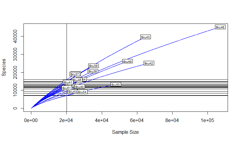
Rarefaction Curve Rarefaction curve is a plot displaying sample depth by species (epitope) identified.
An extreme case for the greatest evenness would be that every dodecapeptide is unique, indicating no specificity (no preference when antibodies bind on epitopes). In contrast, an extreme case for the greatest richness would be that all reads are the same dodecapeptide, indicating high affinity and specificity (antibodies have preference for a specific epitope).
library(plry)  #### for counting the number of duplicates
library("vegan") #### plot rarefaction curve
library(tidyverse) #### organize dataframe

getwd()
setwd("C:/Users/darsonshu/Documents/Fall_rotation/raw_fasta/Brucella_duplicates/C+S+_2/")

temp1<-list.files(pattern = "*.txt")

myfile1<-lapply(temp1, read.fasta)  #### read all files from the folder

df<-data.frame(matrix(ncol = 2))

#### A loop function to place all sequences into one BIG data frame: 1,000,000 rows!
for (r in 1:length(temp1)) {
        sample=myfile1[[r]]
        b[r]=length(sample)

        for (c in (sum(b)-b[r]+1):sum(b)) {

          df[c,1]<-paste(sample[[sum(b)-c+1]][1:12],collapse = "")
          df[c,2]<-substr(temp1[r],1,5)
        }

}

df$X2<-as.factor(df$X2)
df$X1<-as.factor(df$X1)


df2 <- count(df,vars=c("X1","X2")) #### only keep unique reads and the counts

df3<-df2 %>% pivot_wider(names_from = X1, values_from = freq, values_fill = 0) #### convert the df from long to wide
df3<-as.data.frame(df3)
rownames(df3)<-df3$X2

df3<-df3[,-1]
df4<-df3[,order(-colSums(df3))]  #### see which read is the most abundant across samples


S <- specnumber(df3) # observed number of species

S_df<-as.data.frame(S)
S_df$sample<-rownames(S_df)

S_df$sample<-factor(S_df$sample)

boxplot(S_df$S)

(raremax <- min(rowSums(df3)))

dim(df3)
Srare <- rarefy(df3, raremax)
plot(S, Srare, xlab = "Observed No. of Species", ylab = "Rarefied No. of Species")
abline(0, 1)
rarecurve(df3, step = 20, sample = raremax, col = "blue", cex = 0.6)